Difference between revisions of "CyberShake UCERF3 Migration"
| Line 8: | Line 8: | ||
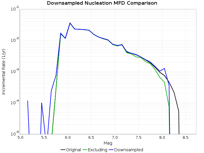
The following figure shows the resulting MFD following this downsampling proceedure (blue curve). The original MFD (black curve) and MFD were we to just exclude partial ruptures rather than add their rate to subset ruptures (green curve) are also shown. Note that these are nucleation MFDs (as opposed to participation) and only include supra-seismogenic fault ruptures. | The following figure shows the resulting MFD following this downsampling proceedure (blue curve). The original MFD (black curve) and MFD were we to just exclude partial ruptures rather than add their rate to subset ruptures (green curve) are also shown. Note that these are nucleation MFDs (as opposed to participation) and only include supra-seismogenic fault ruptures. | ||
[[File:UCERF3_Subset_MFD_comparison.png]] | [[File:UCERF3_Subset_MFD_comparison.png]] | ||
| + | |||
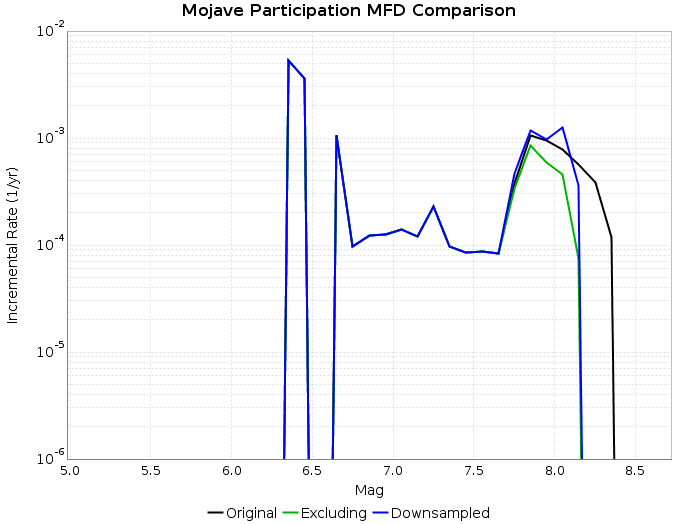
| + | The following figure shows a participation MFD for the Mojave (S) section of the San Andreas to better illustrate the consequences of applying this algorithm (same colors). | ||
| + | [[File:UCERF3_Subset_Mojave_MFD_comparison.png]] | ||
=== Hazard Curve Comparison === | === Hazard Curve Comparison === | ||
Revision as of 20:27, 11 May 2015
This page will be used to document progress migrating CyberShake to UCERF3
GMPE Downsampling Test
This tests creates a downsampled UCERF3 forecast for southern california. Every rupture that is outside of Southern California (using the white dashed dividing line seen in the figure on the front of the UCERF3 Fact Sheet) is removed. If a rupture is partially outside, it is removed and its rate is added to the largest subset rupture which is entirely inside the region. This results in 64992/253706 ruptures retained for UCERF3 Fault Model 3.1.
MFD Comparison
The following figure shows the resulting MFD following this downsampling proceedure (blue curve). The original MFD (black curve) and MFD were we to just exclude partial ruptures rather than add their rate to subset ruptures (green curve) are also shown. Note that these are nucleation MFDs (as opposed to participation) and only include supra-seismogenic fault ruptures.
The following figure shows a participation MFD for the Mojave (S) section of the San Andreas to better illustrate the consequences of applying this algorithm (same colors).
Hazard Curve Comparison
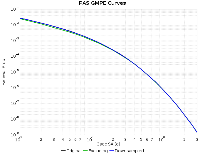
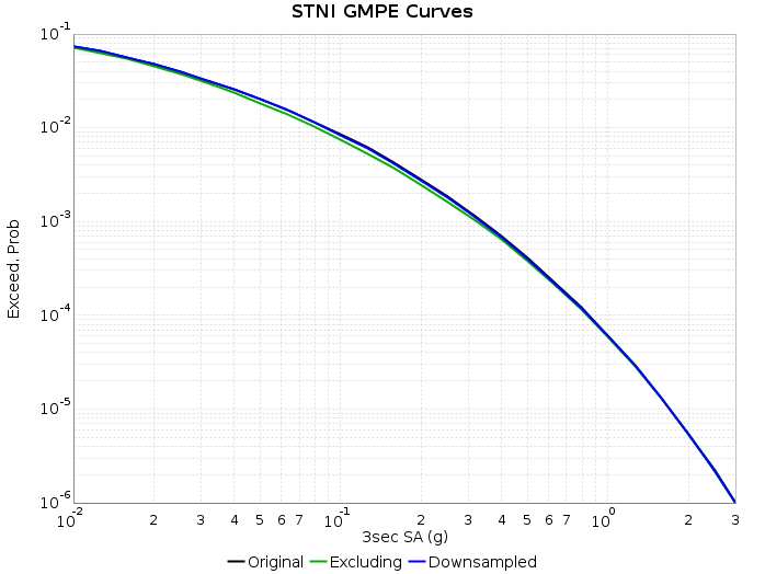
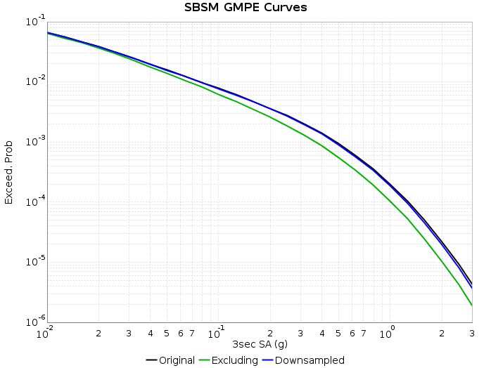
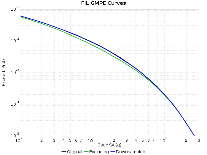
The following figures show the hazard curve calculations using the average NGA-West2 GMPE following this downsampling proceedure (blue curves). The original curve (black curves) and curve were we to just exclude partial ruptures rather than add their rate to subset ruptures (green curves) are also shown. These calculations are for 3 second SA and include site effects (Wills 2006 Vs30 and Z1.0/2.5 from CVM-S4.26).
