Difference between revisions of "CyberShake interpolation"
| (61 intermediate revisions by the same user not shown) | |||
| Line 3: | Line 3: | ||
[https://github.com/ameliakratzer-code/Pasadena Source Code] | [https://github.com/ameliakratzer-code/Pasadena Source Code] | ||
| − | == Hazard Curves == | + | == Bilinear: Hazard Curves == |
=== Procedure === | === Procedure === | ||
| Line 85: | Line 85: | ||
I will next try to interpolate the shaking RotD50 values themselves to see if the interpolation is more accurate than that of the hazard curves. | I will next try to interpolate the shaking RotD50 values themselves to see if the interpolation is more accurate than that of the hazard curves. | ||
| − | == Intensity Measures == | + | == Bilinear: Intensity Measures == |
=== Procedure === | === Procedure === | ||
| Line 91: | Line 91: | ||
*A key difference to note between interpolating hazard curves versus IM values for a site is that there was a lot more data that needed to be interpolated with the IM values. Hence, I switched to running my code on Frontera.<br> | *A key difference to note between interpolating hazard curves versus IM values for a site is that there was a lot more data that needed to be interpolated with the IM values. Hence, I switched to running my code on Frontera.<br> | ||
*My code interpolates a single event, which has a unique event id, all rupture variations for a single rupture, or all events for a site. | *My code interpolates a single event, which has a unique event id, all rupture variations for a single rupture, or all events for a site. | ||
| − | *After I ran the interpolation code, I used the interpolated IM values to create hazard curves for the interp sites. I then compared these | + | *After I ran the interpolation code, I used the interpolated IM values to create hazard curves for the interp sites. I then compared these curves to the hazard curves produced from the direct interpolation of a site's hazard curves and the simulated hazard curve. |
=== Results === | === Results === | ||
| + | To measure my accuracy, I created scatterplots comparing the simulated to the interpolated IMs and histograms of their percent differences. <br> | ||
| + | * 4 sites, all in basin | ||
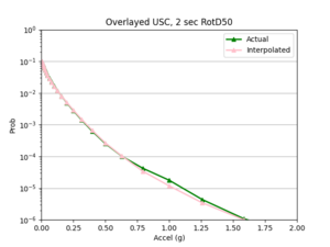
| + | a) USC area all events | ||
| + | {| class="wikitable" | ||
| + | |- | ||
| + | | [[File:USCAll1.png|thumb]] | ||
| + | | [[File:USCcurve.png|thumb]] | ||
| + | | [[File:USC10a.png|thumb]] | ||
| + | | [[File:USC10b.png|thumb]] | ||
| + | |} | ||
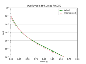
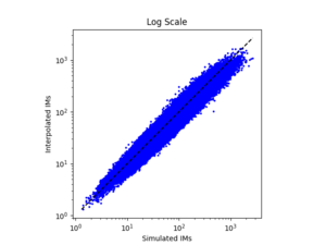
| + | b) S366 area all events (includes log plot) | ||
| + | {| class="wikitable" | ||
| + | |- | ||
| + | | [[File:S366reg.png|thumb]] | ||
| + | | [[File:S366log.png|thumb]] | ||
| + | |} | ||
| + | <br> | ||
| + | * 4 sites, not all in basin | ||
| + | a) SGRTT area all events | ||
| + | {| class="wikitable" | ||
| + | |- | ||
| + | | [[File:SGRTT1.png|thumb]] | ||
| + | |} | ||
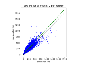
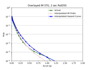
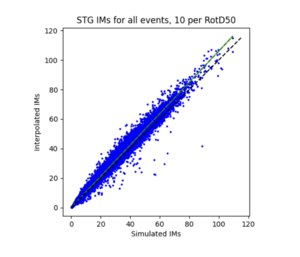
| + | b) STG area all events | ||
| + | {| class="wikitable" | ||
| + | |- | ||
| + | | [[File:STG1.png|thumb]] | ||
| + | | [[File:STGcurve.png|thumb]] | ||
| + | | [[File:STG10a.png|thumb]] | ||
| + | | [[File:STG10b.png|thumb]] | ||
| + | |} | ||
| + | <br> | ||
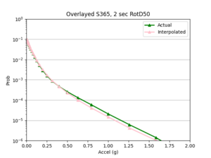
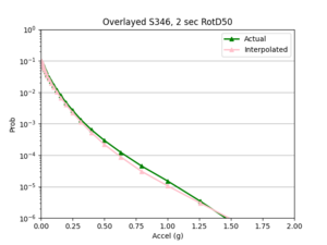
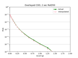
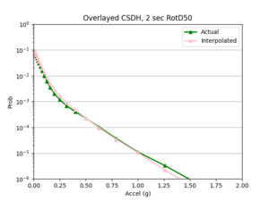
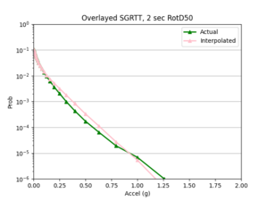
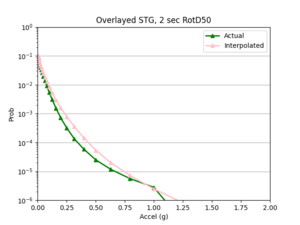
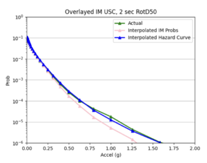
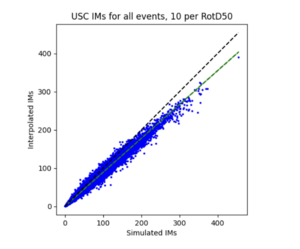
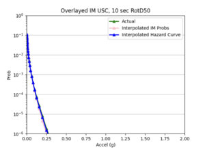
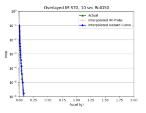
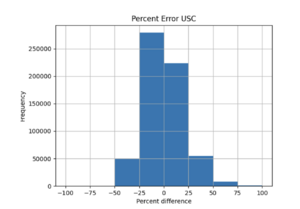
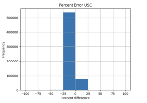
| + | For both USC and STG, there is a greater amount of scatter for period 2 compared to period 10. This is reflected in the hazard curve plots since the period 10 IM interpolated curves more closely resemble the simulated curves than the period 2 IM interpolated curves. Also, for both USC and STG, compared to the period 2 histograms, the period 10 histograms have lower frequency of more extreme percent differences.<br> | ||
| + | {| class="wikitable" | ||
| + | |- | ||
| + | | [[File:1.png|thumb]] | ||
| + | | [[File:2.png|thumb]] | ||
| + | | | ||
| + | |} | ||
| + | On left: period 2 plot USC, on right: period 10 plot USC | ||
| + | |||
| + | <br> '''Findings: interpolating the hazard curves produces more accurate results than interpolating the IM values.''' <br> | ||
| + | '''The overlaid hazard curve plots show that the interpolated hazard curve more closely resembles the simulated curve than the interpolated IM curve.''' <br> | ||
| + | This is likely due to the under prediction of the IM values for magnitude 7 - 8 events as shown by the scatterplot by magnitude plot below. <br> | ||
| + | [[File:MagPlot.png|500px]] | ||
| + | |||
| + | == ML: Hazard Curves == | ||
| + | |||
| + | I first created a csv file containing all CyberShake sites that are not on the 10km grid but have 4 surrounding input sites, as these data points are used as input for my ML model. <br> | ||
| + | |||
| + | 1) I wanted to start simple, so I created a network to interpolate the hazard curve probabilities at x = 0.50119 g. <br> | ||
| + | |||
| + | a) Neural network architecture | ||
| + | * 8 inputs: the probability values of the 4 sites on the 10km grid along with there distances to the interpolated site. | ||
| + | * 1 output: the interpolated probability value | ||
| + | * 5 hidden layers with softplus activation function | ||
| + | * I log normalized the probabilities and output and normalized the distances | ||
| + | |||
| + | <br> | ||
| + | b) Results <br> | ||
| + | i) Initial run <br> | ||
| + | |||
| + | My model appeared to be overfitted since the training loss was significantly better than the testing loss, so I reduced the number of hidden layers from 5 to 3 and removed 3 repetitive data points from input csv. <br> | ||
| + | [[File:a.png|500px]] | ||
| + | [[File:b.png|500px]] | ||
| + | |||
| + | Focusing on improving the loss curves, I decreased the batch size from 32 to 16 and reduced the number of epochs from 50 to 20. This resulted in my model converging too quickly (below). <br> | ||
| + | [[File:batch1.png|500px]] | ||
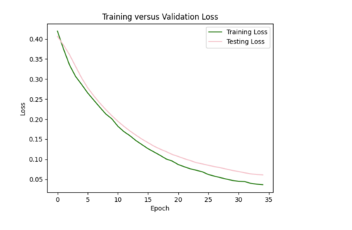
| + | <br> Keeping the batch size at 16, I increased the epochs from 20 to 35, allowing the model to train over a longer period. <br> | ||
| + | [[File:batch2.png|500px]] <br> | ||
| + | |||
| + | ii) L2 regularizer to reduce overfitting: As my model was still overfitting, I used the L2 regularizer with 0.0035 strength. This increased my total test loss to 0.11 from 0.07, since L2 has a larger penalty for higher weights, but helped my test loss curve to more closely resemble training loss. <br> | ||
| + | [[File:batch3.png|500px]] <br> | ||
| + | |||
| + | I also tried to implement dropout after each hidden layer to ensure my model was not dependent on any single neuron, but this resulted in my model losing too much data causing high variance in loss (not a smooth curve). For half the epochs, the testing loss was better than the training loss, which it shouldn't be. <br> | ||
| + | [[File:batch4.png|500px]] <br> | ||
| + | |||
| + | iii) Changing learning rate of Adam optimizer: to further improve my model, I increased the learning rate from the default of 0.001 to 0.0016, which helped to decrease the test loss to 0.07. <br> | ||
| + | [[File:batch5.png|500px]] <br> | ||
| + | |||
| + | |||
| + | '''I ended up sticking with the L2 regularizer and increased learning rate since this seemed like the best combination to reduce overfitting.''' | ||
| + | |||
| + | iv) Changing my simulated versus interpolated values plot to log scale and adding a line of best fit and y = x. <br> | ||
| + | [[File:batch6.png|500px]] <br> | ||
| + | |||
| + | The y = x line is significantly steeper than the line of best fit. This might be because the probability values we are dealing with are so small, so y =x doesn't fairly represent the accuracy of my model. For some reason, all the interpolated values are in the 10^-4 range. Below is just a plot with the line of best fit. <br> | ||
| + | [[File:batch7.png|500px]] <br> | ||
| + | |||
| + | v) Impact of adding velocity parameters to my model: I tested the affect of adding different combinations of the velocity metrics as input to my model. <br> | ||
| + | Just Vs30 <br> | ||
| + | [[File:batch8.png|500px]] <br> | ||
| + | [[File:batch8b.png|500px]] <br> | ||
| + | |||
| + | Loss is 0.07 which is similar to the test loss for the model without Vs30 inputs. Difference to the plot without Vs30 values is I would say points here are on or nearer to the line, but not significantly. <br> | ||
| + | |||
| + | Just Z1_0 <br> | ||
| + | [[File:batch9.png|500px]] <br> | ||
| + | [[File:batch9b.png|500px]] <br> | ||
| + | |||
| + | Slightly reduced test loss of 0.06, but scatterplot looks very similar. <br> | ||
| + | |||
| + | Just Z2_5 <br> | ||
| + | [[File:batch10.png|500px]] <br> | ||
| + | [[File:batch10b.png|500px]] <br> | ||
| + | |||
| + | Not much improvement in loss or scatterplot <br> | ||
| + | |||
| + | Vs30 and Z2_5 <br> | ||
| + | [[File:batch11.png|500px]] <br> | ||
| + | [[File:batch11b.png|500px]] <br> | ||
| + | |||
| + | Loss closer to 0.05. <br> | ||
| + | |||
| + | Vs30, Z1_0, and Z2_5 <br> | ||
| + | [[File:batch12.png|500px]] <br> | ||
| + | [[File:batch12b.png|500px]] <br> | ||
| + | |||
| + | Loss still 0.07, no improvement from just including Vs30 and Z2_5. <br> | ||
| + | |||
| + | '''While including the velocity metrics as input do not improve my model significantly, I chose to continue with the Vs30 and Z2_5 combination as inputs for their slight improvement. An interesting finding is that the velocity metrics did not seem to improve the interpolations when I was doing bilinear interpolation either.''' <br> | ||
| + | |||
| + | 2) Next, I created a larger model that interpolates the hazard curve probabilities at all 51 x values. <br> | ||
| + | a) Neural network architecture | ||
| + | * 208 inputs: the probability values of the 4 sites on the 10km grid at each of the 51 x values, along with there distances to the interpolated site. | ||
| + | * 51 outputs: the interpolated probability values at each x value | ||
| + | * 3 hidden layers with softplus activation function | ||
| + | * I log normalized the probabilities and output and normalized the distances | ||
| + | |||
| + | <br> b) Results <br> | ||
| + | i) Initial run <br> | ||
| + | [[File:ML1.png|500px]] <br> | ||
| + | |||
| + | ii) Reducing overfitting <br> | ||
| + | I started with the L2 regularizer with strength 0.001, which resulted in my testing curve more closely resembling my training curve. However, the test loss increased to 0.06. <br> | ||
| + | [[File:ML2.png|500px]] <br> | ||
| + | |||
| + | Trying the same regularizer with 0.002 strength. Loss increased to 0.07.<br> | ||
| + | [[File:ML3.png|500px]] <br> | ||
| + | |||
| + | Trying regularizer with 0.005 strength. Loss increased to 0.11, but overfitting improved. It is a little difficult to tell exactly how much the loss curves improved by since they have different scales. <br> | ||
| + | [[File:ML4.png|500px]] <br> | ||
| + | |||
| + | Trying dropout of 0.5 after each of the three hidden layers. This resulted in the test curve being significantly better than the training curve. <br> | ||
| + | [[File:ML5.png|500px]] <br> | ||
| + | |||
| + | To decrease the loss to 0.06 from 0.11, I increased the learning rate for the Adam optimizer to 0.0015 from the default of 0.001. If I decide to include velocity metrics in other models, I will likely stick with this modified learning rate combined with the l2 regularizer of 0.005.<br> | ||
| + | [[File:ML6.png|500px]] <br> | ||
| + | |||
| + | iii) Hazard curve plots <br> | ||
| + | To compare the accuracy of my ML model to the bilinear interpolation of the hazard curves, I created an overlaid plot for each of the 20 test sites of the simulated versus interpolated hazard curve. I also calculated the average and max percent difference per site, and included this in a csv file with my overlaid plots. <br> | ||
| + | Here are a couple examples of plots my sites produced and their corresponding error metrics: <br> | ||
| + | |||
| + | Max percent difference: 127.9776541629529%, avg percent difference: 20.727127099607557%<br> | ||
| + | [[File:s505ML.png|500px]] <br> | ||
| + | Max: 130.7296191395941%, Average: 27.58752181123163%<br> | ||
| + | [[File:COOML.png|500px]] <br> | ||
| + | |||
| + | The ML model as it currently stands is significantly worse at interpolating hazard curves than bilinear interpolation. The ML interpolated hazard curves are very choppy and do not do a good job of modeling the simulated hazard curve. <br> | ||
| + | |||
| + | 3) Since the large model was not very accurate, I decided to create 51 smaller models, one for each of the 51 x values. Each model is similar to the x = 0.50119 g model in (1). <br> | ||
| + | a) The main difference between these smaller models and the model in (1) is I included extra inputs: the probability values of the 4 input sites and interp site at the x value below and above the x value I want to interpolate at. For instance, for my smaller model that interpolated x = 0.50119 g, I included 10 additional inputs: the LB, RB, LT, RT, interpsite probs at x = 0.39811 g and 0.63096 g. <br> | ||
| + | Note that since including the velocity metrics increases the complexity of my network without much gain, I excluded them as inputs for these smaller models. <br> | ||
| + | |||
| + | b) Results <br> | ||
| + | I used sites COO and s505's hazard curves as references while I tweaked different hyperparameters to improve loss. <br> | ||
| + | i) Initial run <br> | ||
| + | Example of error plot <br> | ||
| + | [[File:abc1.png|500px]] <br> | ||
| + | [[File:abc2.png|500px]] <br> | ||
| + | [[File:abc3.png|500px]] <br> | ||
| + | ii) Tweaking parameters since the test loss curves did not closely resemble the training loss curves. <br> | ||
| + | Increased batch size to 32 which made loss curve worse and created a hazard curve with unrealistic variations in probability.<br> | ||
| + | [[File:abc4.png|500px]] <br> | ||
| + | Reset batch size to 16, and added l2 regularizer with 0.0035 strength since this worked well for my smaller single model.<br> | ||
| + | [[File:abc5.png|500px]] <br> | ||
| + | [[File:abc6.png|500px]] <br> | ||
| + | [[File:abc7.png|500px]] <br> | ||
| + | I ended up sticking with this regularization. <br> | ||
| + | <br> | ||
| + | Insight: one pattern I noticed was my interpolations tended to be better for smaller x values compared to larger ones, as the interpolated hazard curves tended to more closely follow the simulated hazard curves at lower x values, and then diverged. This may be because my data is denser at lower x values, and less dense at higher x values, so my model struggles more to infer probabilities at these higher values. | ||
| + | |||
| + | '''Overall, these smaller models were not much better than the larger model in (2). Neither are very accurate at interpolating the hazard curves.''' | ||
| + | |||
| + | <br> Next steps: I'm going to try next to build a model to interpolate the IM values instead of the hazard curves. My hypothesis is that the IM interpolation should be better than that of the hazard curve. This is because the hazard curve probabilities are expected values, of sorts, so ML might be better at handling IM values which are the pure data as the relationships between the data points may be more clear. <br> | ||
| + | |||
| + | == ML: Intensity Measures == | ||
| + | |||
| + | I created an input csv file with columns: 'd1', 'd2', 'd3', 'd4','IMLB', 'IMRB', 'IMRT', 'IMLT', 'IMInterp'. <br> | ||
| + | |||
| + | 1) I wanted to start simple, so I created a network to interpolate the IM values for a single event for this site group ('s385','s429','s431','s387','COO'). I could only train it well to deal with a portion of the 600,000 shared events for the site group. <br> | ||
| + | |||
| + | a) Neural network architecture <br> | ||
| + | |||
| + | 8 inputs: the IM values of the 4 sites for an event and their distances to the interpolated site <br> | ||
| + | 1 output: the interpolated IM value for that event <br> | ||
| + | 3 hidden layers with softplus activation function <br> | ||
| + | I normalized the X inputs and y labels. <br> | ||
| + | |||
| + | b) Results <br> | ||
| + | i) Initial run <br> | ||
| + | It seems like my model cannot handle the 600,000 samples and learned way too fast. The test loss is Nan for all epochs (had batch size of 128, 50 epochs for the initial run). <br> | ||
| + | [[File:auga.png|500px]] <br> | ||
| + | [[File:augb.png|500px]] <br> | ||
| + | |||
| + | ii) Changes to improve my model <br> | ||
| + | I decreased the number of samples down to 2000, in order to prevent my test loss from going to Nan. I changed by batch size to 16, epochs to 35. I still need to play around with the hyperparameters since the test loss curve fluctuates too much. <br> | ||
| + | [[File:augc.png|500px]] <br> | ||
| + | [[File:augd.png|500px]] <br> | ||
| + | |||
| + | I increased my batch size to 64 to smooth out the loss curves, but the error plot still needs improved. <br> | ||
| + | [[File:auge.png|500px]] <br> | ||
| + | [[File:augf.png|500px]] <br> | ||
| + | |||
| + | I tried to log transform the IM values, but this worsened both the error plots and scatterplots. <br> | ||
| + | [[File:augg.png|500px]] <br> | ||
| + | [[File:augh.png|500px]] <br> | ||
| + | |||
| + | I then reverted back to no log transformations and added in l2 regularizer of 0.005 which helped tremendously. The error plot was a lot better, but the scatterplot was worse and interpolated values were lower overall since l2 penalizes large weights leading to smaller weights. <br> | ||
| + | [[File:augi.png|500px]] <br> | ||
| + | [[File:augj.png|500px]] <br> | ||
| + | |||
| + | The batch size was currently 64, so I tried reducing it to 32 while maintaining the l2 strength of 0.005 and 35 epochs. This improved the scatterplot but the test curve still needs help. <br> | ||
| + | [[File:augk.png|500px]] <br> | ||
| + | [[File:augl.png|500px]] <br> | ||
| + | |||
| + | Finally, I decreased number of epochs to 20 from 35 and decreased number of samples to 1800. I chose to stick with these hyperparameters, since the scatterplot and loss curves are both pretty accurate, and while some earlier runs had better scatterplots, the loss curves had too much variation. <br> | ||
| + | [[File:augm.png|500px]] <br> | ||
| + | [[File:augn.png|500px]] <br> | ||
| + | <br> | ||
| + | Next steps: I next need to figure out how to update my model so it can handle all 600,000 events and ultimately perform this interpolation for many site groups as samples. <br> | ||
| + | |||
| + | <br> I realized that my model was having issues with the test loss being NaN, since my input file was missing 400,000 lines of data and the last line had only one value instead of the 8 inputs. Hence, I regenerated my input file, and this seemed to work. <br> | ||
| + | |||
| + | <br> iii) Results with all 600,000 inputs <br> | ||
| + | |||
| + | My first run had 128 batch size, 30 epochs, and l2 regularization with 0.0005 strength. The training loss was a flat line and the testing loss varied too much. Also, the simulated versus interpolated plot was not very good. <br> | ||
| + | |||
| + | [[File:aug8a.png|500px]] <br> | ||
| + | [[File:aug8b.png|500px]] <br> | ||
| + | |||
| + | I next increased the number of hidden layers from 3 to 5 since I'm dealing with a lot of data. I also decreased the learning rate to 0.0001 since my model was converging too early and decreased the number of epochs to 20. This improved my model significantly as the simulated versus interpolated values looked better, although the error loss plot still has room for improvement. <br> | ||
| + | |||
| + | [[File:aug8c.png|500px]] <br> | ||
| + | [[File:aug8d.png|500px]] <br> | ||
| + | |||
| + | I tried decreasing the regularization strength to 0.001 to smooth out the loss curves, but this did not help. <br> | ||
| + | |||
| + | [[File:aug8e.png|500px]] <br> | ||
| + | [[File:aug8f.png|500px]] <br> | ||
| + | |||
| + | I tried a few other things such as decreasing the batch size to 64, increasing the l2 regularization strength, changing the activation functions, decreasing the learning rate further, and applying dropouts but none of these techniques seemed to help. <br> | ||
| + | |||
| + | The best model had the decreased learning rate and 5 hidden layers, but it is still not ideal, maybe due to the relatively simple nature of the data which leads to extremely fast convergence. I'm going to try to increase the number of data samples, and add velocity metrics as input, to increase the complexity of the data, and see if I can create a better model this way. <br> | ||
| + | |||
| + | <br>2) Using the previous model in (1) as a starting point, I expanded my inputs so it includes all events for all sites in my non-10km list. <br> | ||
| + | This involved creating a csv file for each of the events in my list, and combining these files, excluding the files for sites COO, s505, STG, USC, and PLS - my inference sites, into one large file to serve as input to my model. <br> | ||
| + | |||
| + | a) Neural network architecture <br> | ||
| + | 23 inputs: the IM values of the 4 sites for an event, their distances to the interpolated site, input and interp sites' velocity metrics (Vs30, Z1_0, Z2_5) <br> | ||
| + | 1 output: the interpolated IM value for that event <br> | ||
| + | 3 hidden layers with softplus activation function <br> | ||
| + | I normalized the X inputs and y labels. <br> | ||
| + | |||
| + | b) Results <br> | ||
| + | i) Initial run <br> | ||
| + | By reducing the learning rate to 0.000001 and increasing the batch size from 800 to 1000, we were able to get a reasonable error plot, however our model produced the same 96.5 value for all X inference inputs for USC and s505. <br> | ||
| + | [[File:aug12a.png|500px]] <br> | ||
| + | [[File:aug12b.png|500px]] <br> | ||
| + | ii) Improving our model <br> | ||
| + | We tried decreasing the l2 regularization to 0.001 from 0.005, changing to Relu from softplus, and adding a weight initializer, since we suspected that exploding gradients were partly responsible for the poor performance of our model in (i). This helped to improve our hazard curve plot so it was no longer a straight line, but the interpolation was still quite different than the simulated hazard curve. The test loss plot was flat meaning our model still needs further improvement.<br> | ||
| + | [[File:aug12c.png|500px]] <br> | ||
| + | [[File:aug12d.png|500px]] <br> | ||
| + | |||
| + | We changed the size of our 3 input layers to be 64-128-64 from 32-64-128 and increased the learning rate to 0.0001. This improved the fit of our interpolated hazard curve at lower probabilities, but there was significant variance in our test loss plot. <br> | ||
| + | [[File:aug12e.png|500px]] <br> | ||
| + | [[File:aug12f.png|500px]] <br> | ||
| + | |||
| + | Our most successful hazard curve produced from interpolated IMs was when we switched from using mean squared error to using mean absolute error in our model and added 2 more hidden layers. Compared to bilinear interpolation, the hazard curve were not as accurate. <br> | ||
| + | [[File:aug12g.png|500px]] <br> | ||
| + | [[File:aug12h.png|500px]] <br> | ||
| + | |||
| + | c) Since we were not able to find an ideal configuration to handle all 99 non-10 km sites as input, we decided to use 25 non-10km sites, some in the basin and some not in the basin as input samples to our model. This produced better results than using all the input sites. While the ML interpolated IM curve does a good job on average of modeling the simulated hazard curve, it is not as accurate as the bilinear interpolated IM curve. <br> | ||
| + | [[File:aug12i.png|500px]] <br> | ||
| + | [[File:aug12j.png|500px]] <br> | ||
| + | [[File:aug12k.png|500px]] <br> | ||
Latest revision as of 00:09, 15 August 2024
This page documents research into techniques for interpolating various CyberShake data products, performed by 2024 SOURCES intern Amelia Kratzer.
Contents
Bilinear: Hazard Curves
Procedure
Selection of Sites
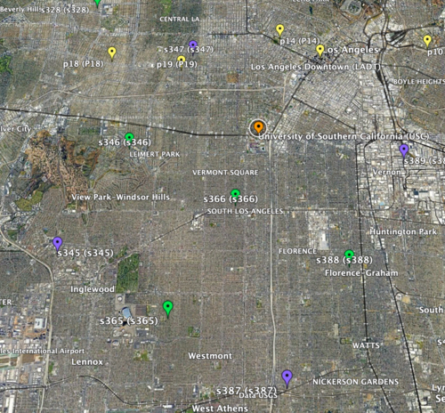
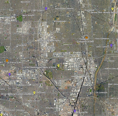
- To start, I selected 4 sites (input sites), all in the basin, that formed a 10km by 10km square inside which there was at least 1 site to interpolate (interp site). This way I could compare the simulated values for that site to the interpolated to check the accuracy of my interpolation.
a) 1st chosen area: USC as there are three sites on the exterior for 1D linear interpolation and two sites on the interior for 2D linear interpolation
b) 2nd chosen area: CSDH
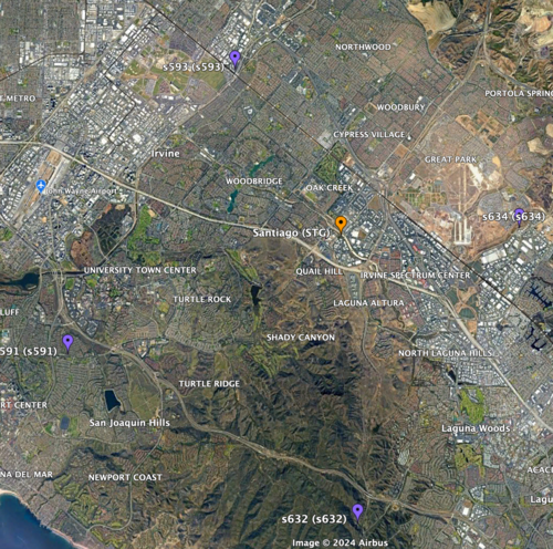
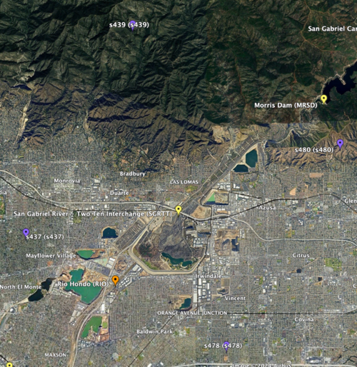
- Next, I selected two locations where some of the sites were not in the basin, to test how different velocity structures may affect the accuracy of the interpolation.
a) 1st location: STG
b) 2nd location: SGRTT
Linear Interpolation of Hazard Curves
- Download and plot the input sites' hazard curves.
- Query CyberShake database to get the X shaking values and Y probability values for input and interp sites.
- Use UTM to convert locations of sites to meters from lat/lon.
- Calculate the X’ and Y’ distances to my interpolated site from the left and top edge of my square since the 10km by 10km square is on a rotated axis.
- For each shaking value, use the probabilities of shaking at the input sites and these X’ and Y’ distances to perform bilinear interpolation.
- Plot the (shaking value, interpolated probability) points to form the interpolated hazard curve.
- Overlay the interpolated hazard curve and the simulated hazard curve on single plot for comparison.
Error Calculations
- I compared the simulated probabilities to the interpolated probabilities for the given site, and calculated the absolute percent difference at each acceleration value. Percent difference accurately models the accuracy of the hazard curve since it reflects the larger differences in the simulated and interpolated results at the higher acceleration values.
- I chose two metrics by which to compare the accuracy of my interpolations - max percent difference and average percent difference.
Results
1D Linear Interpolation
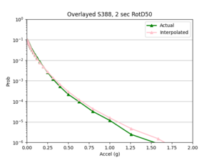
Note: no error metrics were calculated for the 1D linear interpolations, but overlayed plots helped to assess the accuracy of the interpolation.
2D Bilinear Interpolation
- 4 sites, all in basin
a) USC area
b) CSDH area
- 4 sites, not all in basin
a) SGRTT and STG locations
Findings: the bilinear interpolation was more accurate, with a lower max percent difference and average percent difference, when the 4 input sites were all in the basin compared to when I varied the velocity structures of the input sites.
For example, comparing USC, in which all 4 input sites are in the basin, to SGT, where some of the input sites are not in the basin, reveals that the max percent difference for STG was more than double that of USC, 40.4% to 91.1%, respectively. The average percent difference for STG was more than 4 times that of USC, 19.8% to 4.1%, respectively.
Next steps
I will next try to interpolate the shaking RotD50 values themselves to see if the interpolation is more accurate than that of the hazard curves.
Bilinear: Intensity Measures
Procedure
I followed a very similar procedure to the interpolation of the hazard curves. The selection process for the sites and linear interpolation method were identical.
- A key difference to note between interpolating hazard curves versus IM values for a site is that there was a lot more data that needed to be interpolated with the IM values. Hence, I switched to running my code on Frontera.
- My code interpolates a single event, which has a unique event id, all rupture variations for a single rupture, or all events for a site.
- After I ran the interpolation code, I used the interpolated IM values to create hazard curves for the interp sites. I then compared these curves to the hazard curves produced from the direct interpolation of a site's hazard curves and the simulated hazard curve.
Results
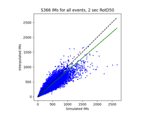
To measure my accuracy, I created scatterplots comparing the simulated to the interpolated IMs and histograms of their percent differences.
- 4 sites, all in basin
a) USC area all events
b) S366 area all events (includes log plot)
- 4 sites, not all in basin
a) SGRTT area all events
b) STG area all events
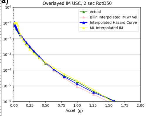
For both USC and STG, there is a greater amount of scatter for period 2 compared to period 10. This is reflected in the hazard curve plots since the period 10 IM interpolated curves more closely resemble the simulated curves than the period 2 IM interpolated curves. Also, for both USC and STG, compared to the period 2 histograms, the period 10 histograms have lower frequency of more extreme percent differences.
On left: period 2 plot USC, on right: period 10 plot USC
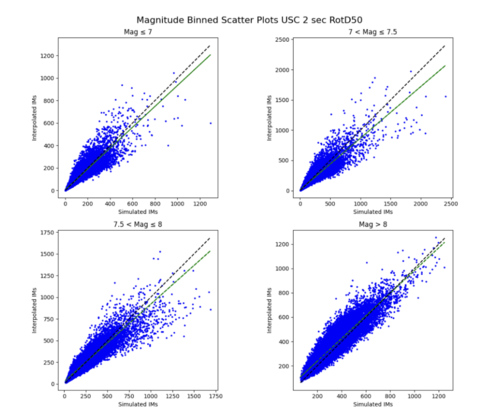
Findings: interpolating the hazard curves produces more accurate results than interpolating the IM values.
The overlaid hazard curve plots show that the interpolated hazard curve more closely resembles the simulated curve than the interpolated IM curve.
This is likely due to the under prediction of the IM values for magnitude 7 - 8 events as shown by the scatterplot by magnitude plot below.
ML: Hazard Curves
I first created a csv file containing all CyberShake sites that are not on the 10km grid but have 4 surrounding input sites, as these data points are used as input for my ML model.
1) I wanted to start simple, so I created a network to interpolate the hazard curve probabilities at x = 0.50119 g.
a) Neural network architecture
- 8 inputs: the probability values of the 4 sites on the 10km grid along with there distances to the interpolated site.
- 1 output: the interpolated probability value
- 5 hidden layers with softplus activation function
- I log normalized the probabilities and output and normalized the distances
b) Results
i) Initial run
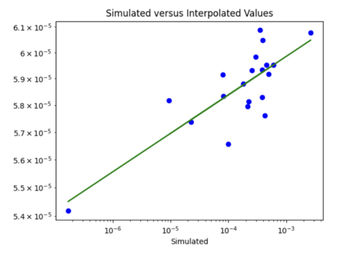
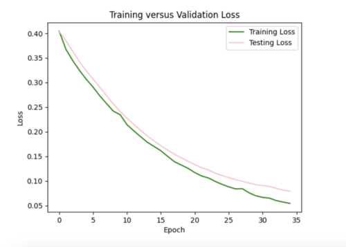
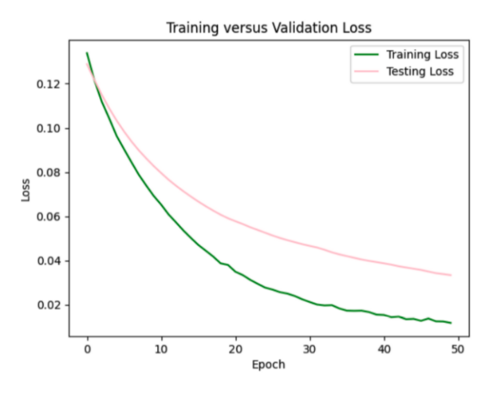
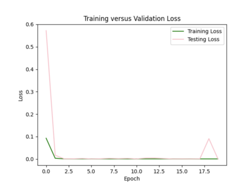
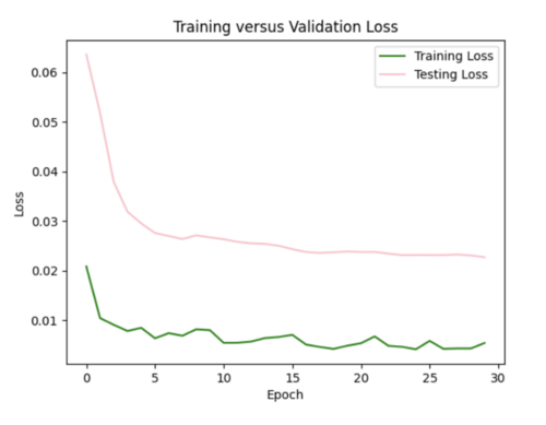
My model appeared to be overfitted since the training loss was significantly better than the testing loss, so I reduced the number of hidden layers from 5 to 3 and removed 3 repetitive data points from input csv.
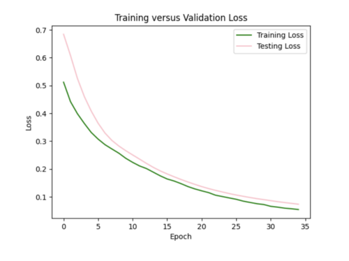
Focusing on improving the loss curves, I decreased the batch size from 32 to 16 and reduced the number of epochs from 50 to 20. This resulted in my model converging too quickly (below).
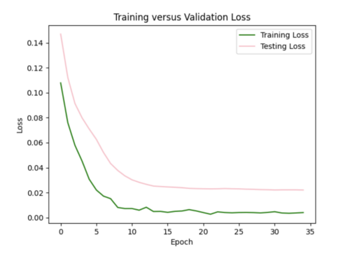
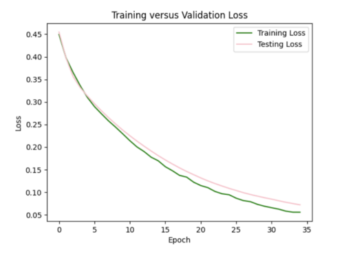
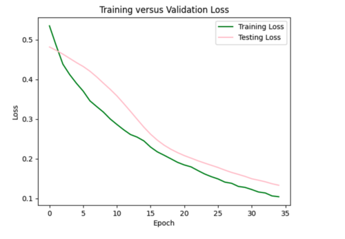
Keeping the batch size at 16, I increased the epochs from 20 to 35, allowing the model to train over a longer period.
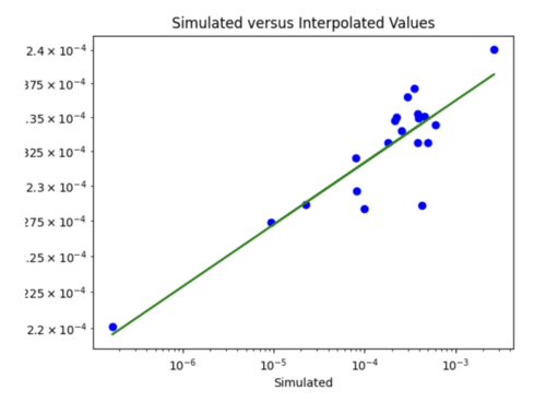
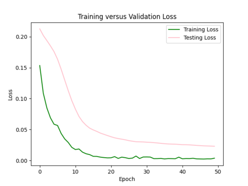
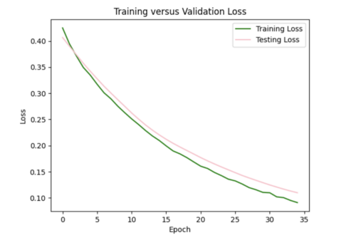
ii) L2 regularizer to reduce overfitting: As my model was still overfitting, I used the L2 regularizer with 0.0035 strength. This increased my total test loss to 0.11 from 0.07, since L2 has a larger penalty for higher weights, but helped my test loss curve to more closely resemble training loss.
I also tried to implement dropout after each hidden layer to ensure my model was not dependent on any single neuron, but this resulted in my model losing too much data causing high variance in loss (not a smooth curve). For half the epochs, the testing loss was better than the training loss, which it shouldn't be.
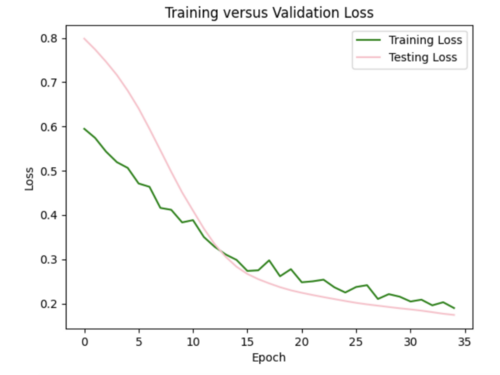
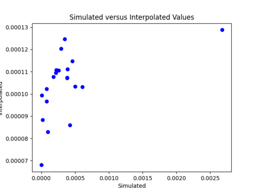
iii) Changing learning rate of Adam optimizer: to further improve my model, I increased the learning rate from the default of 0.001 to 0.0016, which helped to decrease the test loss to 0.07.
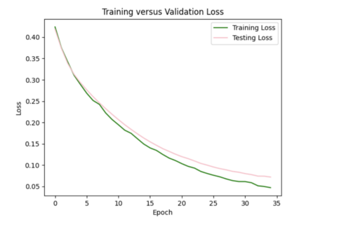
I ended up sticking with the L2 regularizer and increased learning rate since this seemed like the best combination to reduce overfitting.
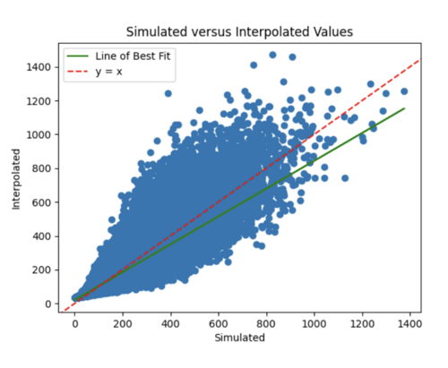
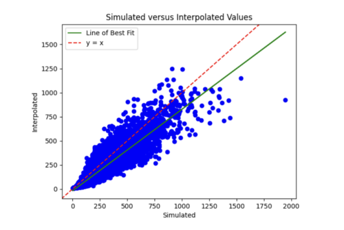
iv) Changing my simulated versus interpolated values plot to log scale and adding a line of best fit and y = x.
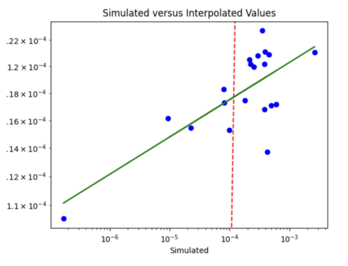
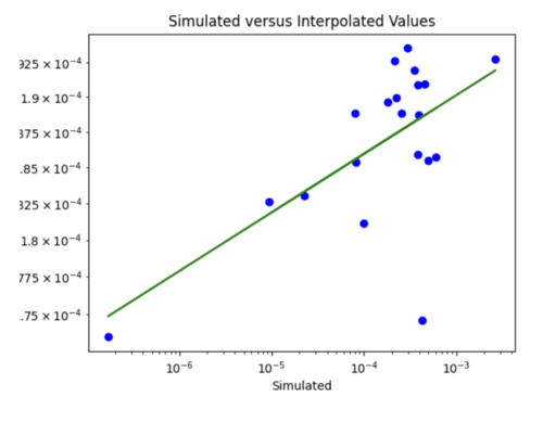
The y = x line is significantly steeper than the line of best fit. This might be because the probability values we are dealing with are so small, so y =x doesn't fairly represent the accuracy of my model. For some reason, all the interpolated values are in the 10^-4 range. Below is just a plot with the line of best fit.
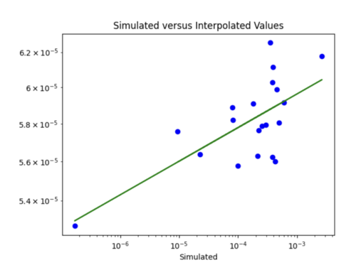
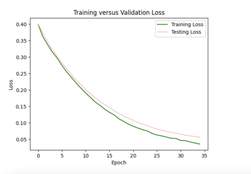
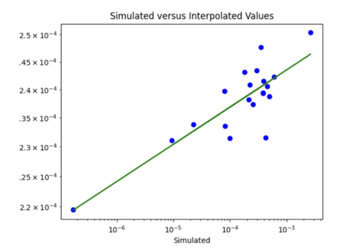
v) Impact of adding velocity parameters to my model: I tested the affect of adding different combinations of the velocity metrics as input to my model.
Just Vs30
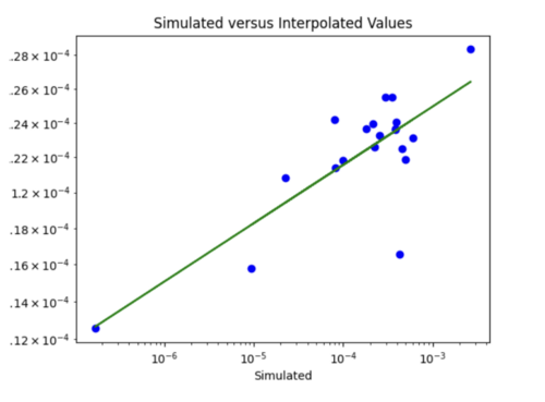
Loss is 0.07 which is similar to the test loss for the model without Vs30 inputs. Difference to the plot without Vs30 values is I would say points here are on or nearer to the line, but not significantly.
Slightly reduced test loss of 0.06, but scatterplot looks very similar.
Not much improvement in loss or scatterplot
Loss closer to 0.05.
Loss still 0.07, no improvement from just including Vs30 and Z2_5.
While including the velocity metrics as input do not improve my model significantly, I chose to continue with the Vs30 and Z2_5 combination as inputs for their slight improvement. An interesting finding is that the velocity metrics did not seem to improve the interpolations when I was doing bilinear interpolation either.
2) Next, I created a larger model that interpolates the hazard curve probabilities at all 51 x values.
a) Neural network architecture
- 208 inputs: the probability values of the 4 sites on the 10km grid at each of the 51 x values, along with there distances to the interpolated site.
- 51 outputs: the interpolated probability values at each x value
- 3 hidden layers with softplus activation function
- I log normalized the probabilities and output and normalized the distances
ii) Reducing overfitting
I started with the L2 regularizer with strength 0.001, which resulted in my testing curve more closely resembling my training curve. However, the test loss increased to 0.06.
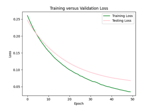
Trying the same regularizer with 0.002 strength. Loss increased to 0.07.
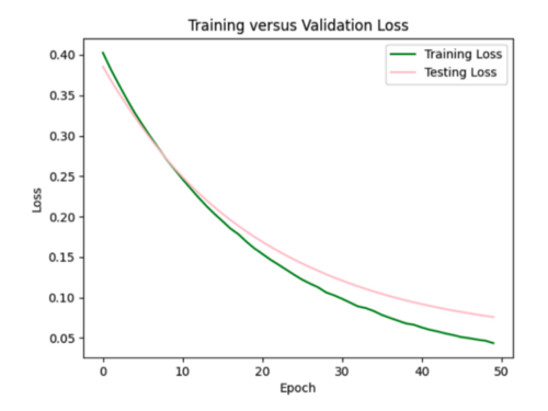
Trying regularizer with 0.005 strength. Loss increased to 0.11, but overfitting improved. It is a little difficult to tell exactly how much the loss curves improved by since they have different scales.
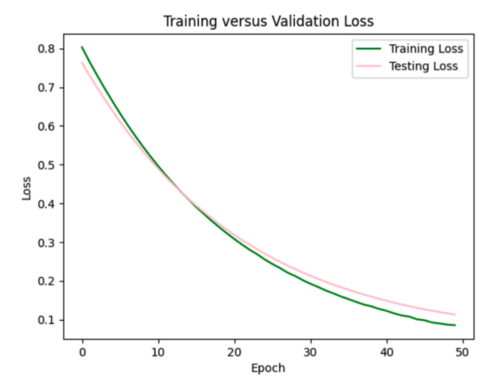
Trying dropout of 0.5 after each of the three hidden layers. This resulted in the test curve being significantly better than the training curve.
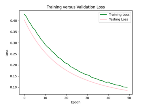
To decrease the loss to 0.06 from 0.11, I increased the learning rate for the Adam optimizer to 0.0015 from the default of 0.001. If I decide to include velocity metrics in other models, I will likely stick with this modified learning rate combined with the l2 regularizer of 0.005.
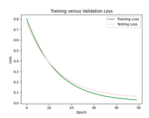
iii) Hazard curve plots
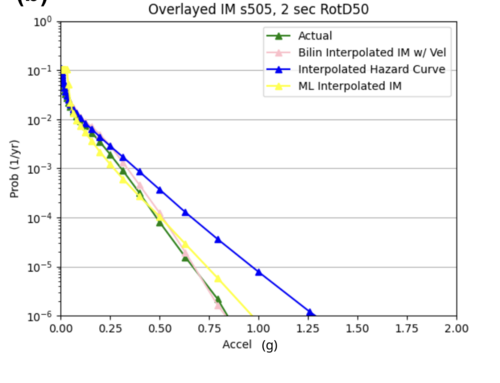
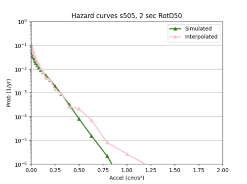
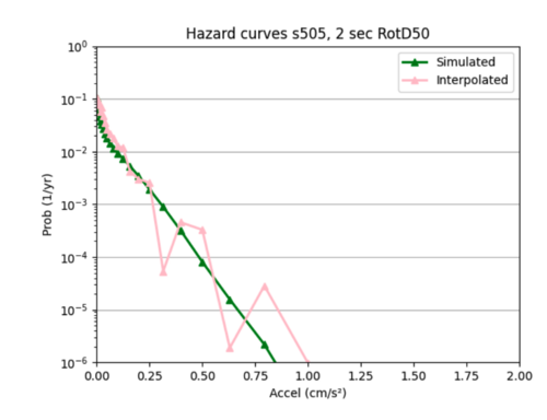
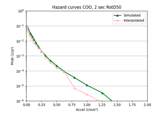
To compare the accuracy of my ML model to the bilinear interpolation of the hazard curves, I created an overlaid plot for each of the 20 test sites of the simulated versus interpolated hazard curve. I also calculated the average and max percent difference per site, and included this in a csv file with my overlaid plots.
Here are a couple examples of plots my sites produced and their corresponding error metrics:
Max percent difference: 127.9776541629529%, avg percent difference: 20.727127099607557%
Max: 130.7296191395941%, Average: 27.58752181123163%
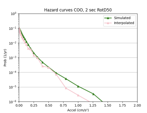
The ML model as it currently stands is significantly worse at interpolating hazard curves than bilinear interpolation. The ML interpolated hazard curves are very choppy and do not do a good job of modeling the simulated hazard curve.
3) Since the large model was not very accurate, I decided to create 51 smaller models, one for each of the 51 x values. Each model is similar to the x = 0.50119 g model in (1).
a) The main difference between these smaller models and the model in (1) is I included extra inputs: the probability values of the 4 input sites and interp site at the x value below and above the x value I want to interpolate at. For instance, for my smaller model that interpolated x = 0.50119 g, I included 10 additional inputs: the LB, RB, LT, RT, interpsite probs at x = 0.39811 g and 0.63096 g.
Note that since including the velocity metrics increases the complexity of my network without much gain, I excluded them as inputs for these smaller models.
b) Results
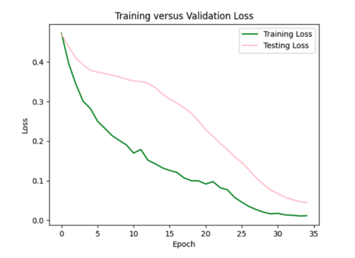
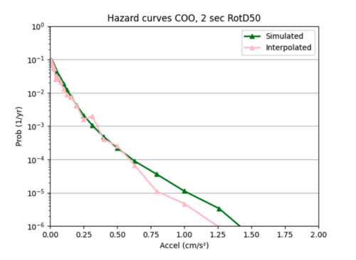
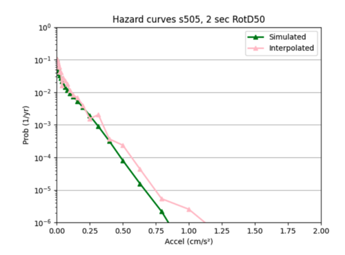
I used sites COO and s505's hazard curves as references while I tweaked different hyperparameters to improve loss.
i) Initial run
Example of error plot
ii) Tweaking parameters since the test loss curves did not closely resemble the training loss curves.
Increased batch size to 32 which made loss curve worse and created a hazard curve with unrealistic variations in probability.
Reset batch size to 16, and added l2 regularizer with 0.0035 strength since this worked well for my smaller single model.
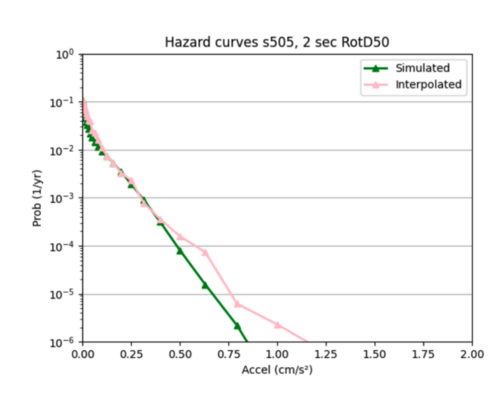
I ended up sticking with this regularization.
Insight: one pattern I noticed was my interpolations tended to be better for smaller x values compared to larger ones, as the interpolated hazard curves tended to more closely follow the simulated hazard curves at lower x values, and then diverged. This may be because my data is denser at lower x values, and less dense at higher x values, so my model struggles more to infer probabilities at these higher values.
Overall, these smaller models were not much better than the larger model in (2). Neither are very accurate at interpolating the hazard curves.
Next steps: I'm going to try next to build a model to interpolate the IM values instead of the hazard curves. My hypothesis is that the IM interpolation should be better than that of the hazard curve. This is because the hazard curve probabilities are expected values, of sorts, so ML might be better at handling IM values which are the pure data as the relationships between the data points may be more clear.
ML: Intensity Measures
I created an input csv file with columns: 'd1', 'd2', 'd3', 'd4','IMLB', 'IMRB', 'IMRT', 'IMLT', 'IMInterp'.
1) I wanted to start simple, so I created a network to interpolate the IM values for a single event for this site group ('s385','s429','s431','s387','COO'). I could only train it well to deal with a portion of the 600,000 shared events for the site group.
a) Neural network architecture
8 inputs: the IM values of the 4 sites for an event and their distances to the interpolated site
1 output: the interpolated IM value for that event
3 hidden layers with softplus activation function
I normalized the X inputs and y labels.
b) Results
i) Initial run
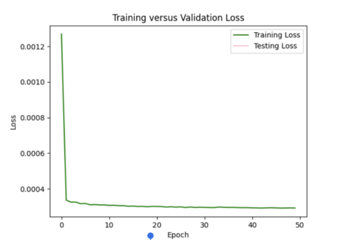
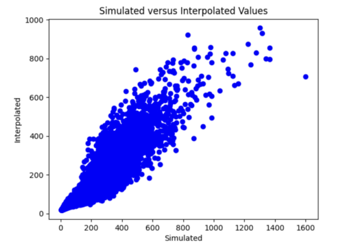
It seems like my model cannot handle the 600,000 samples and learned way too fast. The test loss is Nan for all epochs (had batch size of 128, 50 epochs for the initial run).
ii) Changes to improve my model
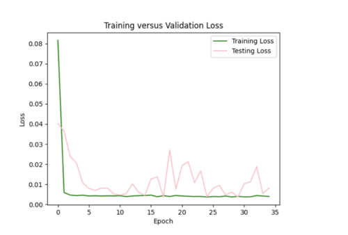
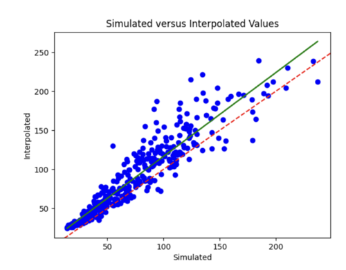
I decreased the number of samples down to 2000, in order to prevent my test loss from going to Nan. I changed by batch size to 16, epochs to 35. I still need to play around with the hyperparameters since the test loss curve fluctuates too much.
I increased my batch size to 64 to smooth out the loss curves, but the error plot still needs improved.
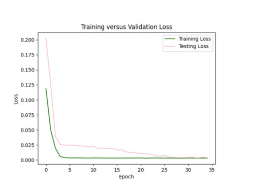
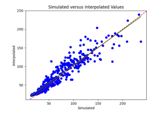
I tried to log transform the IM values, but this worsened both the error plots and scatterplots.
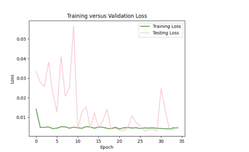
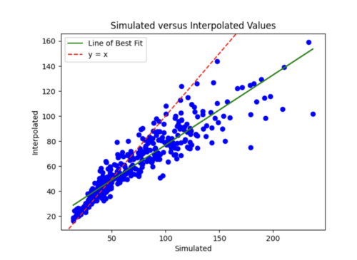
I then reverted back to no log transformations and added in l2 regularizer of 0.005 which helped tremendously. The error plot was a lot better, but the scatterplot was worse and interpolated values were lower overall since l2 penalizes large weights leading to smaller weights.
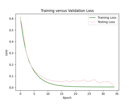
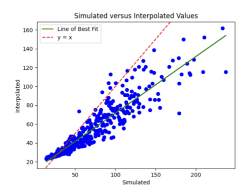
The batch size was currently 64, so I tried reducing it to 32 while maintaining the l2 strength of 0.005 and 35 epochs. This improved the scatterplot but the test curve still needs help.
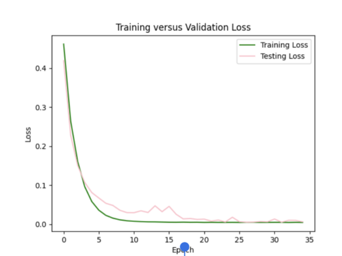
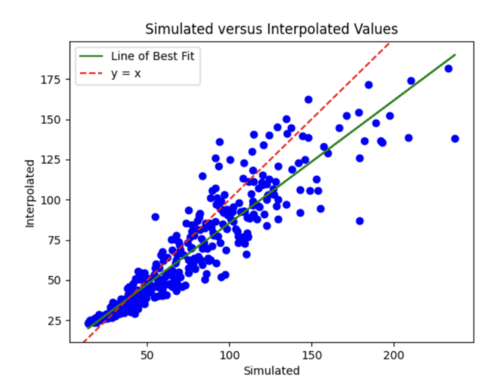
Finally, I decreased number of epochs to 20 from 35 and decreased number of samples to 1800. I chose to stick with these hyperparameters, since the scatterplot and loss curves are both pretty accurate, and while some earlier runs had better scatterplots, the loss curves had too much variation.
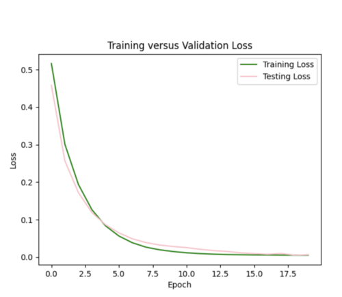
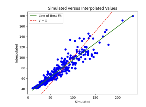
Next steps: I next need to figure out how to update my model so it can handle all 600,000 events and ultimately perform this interpolation for many site groups as samples.
I realized that my model was having issues with the test loss being NaN, since my input file was missing 400,000 lines of data and the last line had only one value instead of the 8 inputs. Hence, I regenerated my input file, and this seemed to work.
iii) Results with all 600,000 inputs
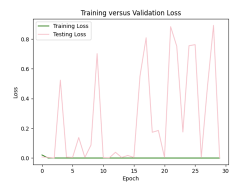
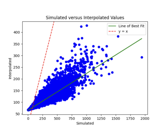
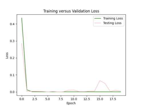
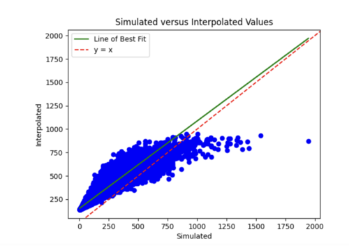
My first run had 128 batch size, 30 epochs, and l2 regularization with 0.0005 strength. The training loss was a flat line and the testing loss varied too much. Also, the simulated versus interpolated plot was not very good.
I next increased the number of hidden layers from 3 to 5 since I'm dealing with a lot of data. I also decreased the learning rate to 0.0001 since my model was converging too early and decreased the number of epochs to 20. This improved my model significantly as the simulated versus interpolated values looked better, although the error loss plot still has room for improvement.
I tried decreasing the regularization strength to 0.001 to smooth out the loss curves, but this did not help.
I tried a few other things such as decreasing the batch size to 64, increasing the l2 regularization strength, changing the activation functions, decreasing the learning rate further, and applying dropouts but none of these techniques seemed to help.
The best model had the decreased learning rate and 5 hidden layers, but it is still not ideal, maybe due to the relatively simple nature of the data which leads to extremely fast convergence. I'm going to try to increase the number of data samples, and add velocity metrics as input, to increase the complexity of the data, and see if I can create a better model this way.
2) Using the previous model in (1) as a starting point, I expanded my inputs so it includes all events for all sites in my non-10km list.
This involved creating a csv file for each of the events in my list, and combining these files, excluding the files for sites COO, s505, STG, USC, and PLS - my inference sites, into one large file to serve as input to my model.
a) Neural network architecture
23 inputs: the IM values of the 4 sites for an event, their distances to the interpolated site, input and interp sites' velocity metrics (Vs30, Z1_0, Z2_5)
1 output: the interpolated IM value for that event
3 hidden layers with softplus activation function
I normalized the X inputs and y labels.
b) Results
i) Initial run
By reducing the learning rate to 0.000001 and increasing the batch size from 800 to 1000, we were able to get a reasonable error plot, however our model produced the same 96.5 value for all X inference inputs for USC and s505.
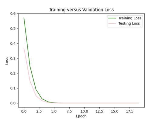
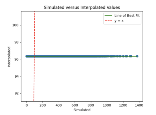
ii) Improving our model
We tried decreasing the l2 regularization to 0.001 from 0.005, changing to Relu from softplus, and adding a weight initializer, since we suspected that exploding gradients were partly responsible for the poor performance of our model in (i). This helped to improve our hazard curve plot so it was no longer a straight line, but the interpolation was still quite different than the simulated hazard curve. The test loss plot was flat meaning our model still needs further improvement.
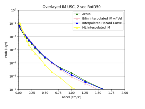
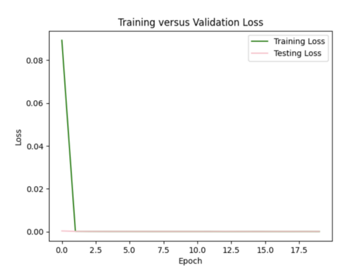
We changed the size of our 3 input layers to be 64-128-64 from 32-64-128 and increased the learning rate to 0.0001. This improved the fit of our interpolated hazard curve at lower probabilities, but there was significant variance in our test loss plot.
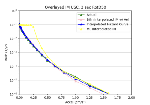
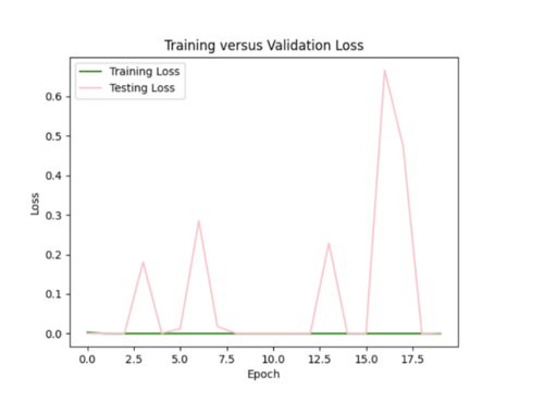
Our most successful hazard curve produced from interpolated IMs was when we switched from using mean squared error to using mean absolute error in our model and added 2 more hidden layers. Compared to bilinear interpolation, the hazard curve were not as accurate.
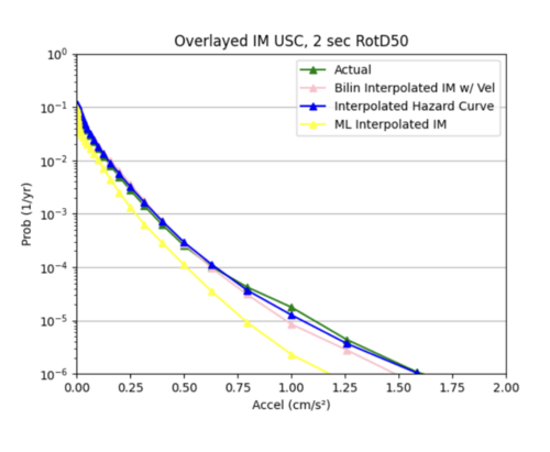
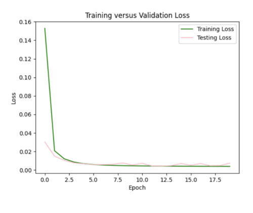
c) Since we were not able to find an ideal configuration to handle all 99 non-10 km sites as input, we decided to use 25 non-10km sites, some in the basin and some not in the basin as input samples to our model. This produced better results than using all the input sites. While the ML interpolated IM curve does a good job on average of modeling the simulated hazard curve, it is not as accurate as the bilinear interpolated IM curve.
