Difference between revisions of "CyberShake UCERF3 Migration"
| Line 137: | Line 137: | ||
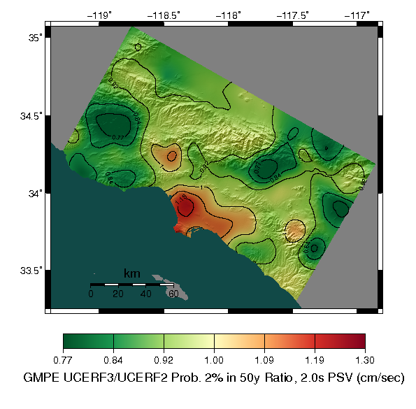
[[File:GMPE_UCERF3_vs_UCERF2_2pin50_ratio_psv_contours.png]] | [[File:GMPE_UCERF3_vs_UCERF2_2pin50_ratio_psv_contours.png]] | ||
| + | |||
| + | === Disaggregation === | ||
| + | |||
| + | I have calculated disaggregated hazard curves for 3 CyberShake sites where the UCERF3/UCERF2 differences are greatest. In all hazard curve and fault magnitude frequency distribution plots linked below, the red curves are for UCERF2 and the blue curves are for UCERF3. All results are for 1 year Poisson models | ||
| + | |||
| + | '''s365: LA Basin (UCERF3 is higher)''' | ||
| + | |||
| + | [[media:GMPE_s365_curves.pdf|Hazard Curves]] [[media:GMPE_s365_ucerf2_disagg.pdf|UCERF2 Disaggregation]] [[media:GMPE_s365_ucerf3_disagg.pdf|UCERF3 Disaggregation]] | ||
| + | |||
| + | This is the center of the red spot in the LA basin. The largest change seems related to the increase in rate on the [http://opensha.usc.edu/ftp/UCERF3.3/Model/FaultMFDs/ParticipationCumulative/Newport_Inglewood_alt_1_cumulative_participation.pdf Newport-Inglewood Fault (MFD plot)]. | ||
| + | |||
| + | '''s541: Claremont Area (UCERF3 is lower)''' | ||
| + | |||
| + | [[media:GMPE_s541_curves.pdf|Hazard Curves]] [[media:GMPE_s541_ucerf2_disagg.pdf|UCERF2 Disaggregation]] [[media:GMPE_s541_ucerf3_disagg.pdf|UCERF3 Disaggregation]] | ||
| + | |||
| + | This is the CyberShake site where the UCERF3/UCERF2 ratio is lowest, in the Claremont area on the southeast side of the San Gabriel Mountains. Hazard at this site in UCERF2 is dominated by the [http://opensha.usc.edu/ftp/UCERF3.3/Model/FaultMFDs/ParticipationCumulative/Cucamonga_cumulative_participation.pdf Cucamonga Fault (MFD plot)] which is treated very differently in UCERF3. It is allowed to link up with other faults in UCERF3 resulting in a large decrease in the overall rate of events, instead participating in larger more infrequent events. | ||
Revision as of 19:35, 16 June 2015
This page will be used to document progress migrating CyberShake to UCERF3
Contents
GMPE Downsampling Test
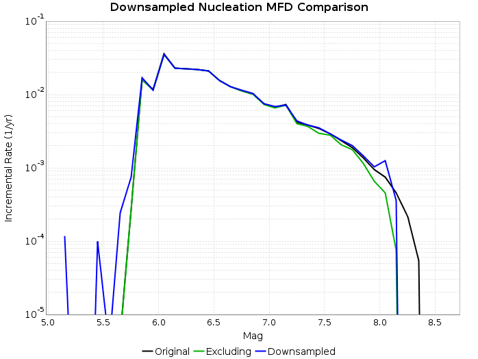
This tests creates a downsampled UCERF3 forecast for southern california. Every rupture that is outside of Southern California (using the white dashed dividing line seen in the figure on the front of the UCERF3 Fact Sheet) is removed. If a rupture is partially outside, it is removed and its rate is added to the largest subset rupture which is entirely inside the region. This results in 64992/253706 ruptures retained for UCERF3 Fault Model 3.1.
MFD Comparison
The following figure shows the resulting MFD following this downsampling proceedure (blue curve). The original MFD (black curve) and MFD were we to just exclude partial ruptures rather than add their rate to subset ruptures (green curve) are also shown. Note that these are nucleation MFDs (as opposed to participation) and only include supra-seismogenic fault ruptures.
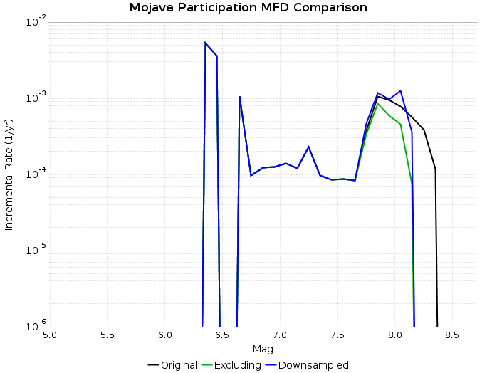
The following figure shows a participation MFD for the Mojave (S) section of the San Andreas to better illustrate the consequences of applying this algorithm (same colors).
Hazard Curve Comparison
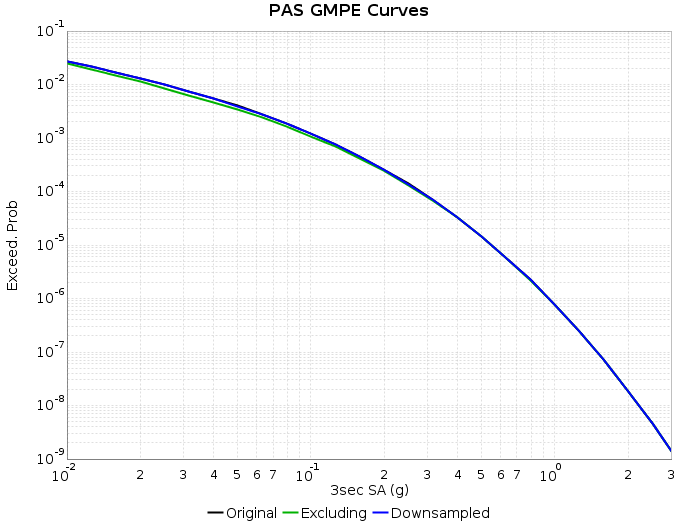
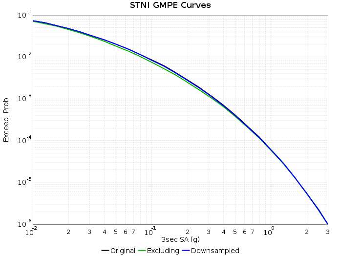
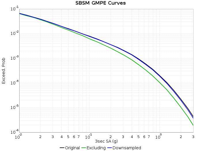
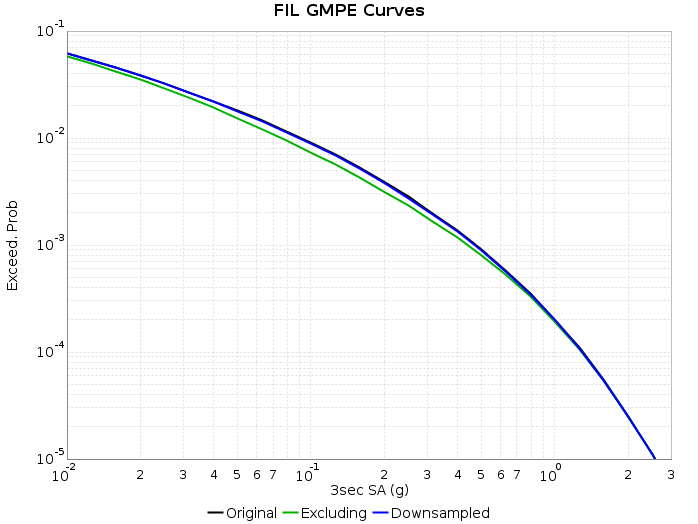
The following figures show the hazard curve calculations using the average NGA-West2 GMPE following this downsampling proceedure (blue curves). The original curve (black curves) and curve were we to just exclude partial ruptures rather than add their rate to subset ruptures (green curves) are also shown. These calculations are for 3 second SA and include site effects (Wills 2006 Vs30 and Z1.0/2.5 from CVM-S4.26).
Aleatory Magnitude Variability Test
UCERF2 applied aleatory magnitude variability to all non-floating rupture sources. This was applied as a truncated Gaussian with sigma=0.12, truncated on either side at 2 sigma.
For example, the SAF S. Mojave characteristic source has 7 ruptures with identical full segment rupture surfaces but varying magnitudes and probabilities. Here are the ruptures and their associated probabilities:
| Source ID | Rupture ID | Magnitude | Probability |
|---|---|---|---|
| 90 | 0 | 6.95 | 7.77415e-06 |
| 90 | 1 | 7.05 | 4.2332184e-05 |
| 90 | 2 | 7.15 | 0.000109296016 |
| 90 | 3 | 7.25 | 0.00015457721 |
| 90 | 4 | 7.35 | 0.00012129413 |
| 90 | 5 | 7.45 | 5.2423315e-05 |
| 90 | 6 | 7.55 | 1.0574104e-05 |
UCERF2/CyberShake Hazard Curve Comparison
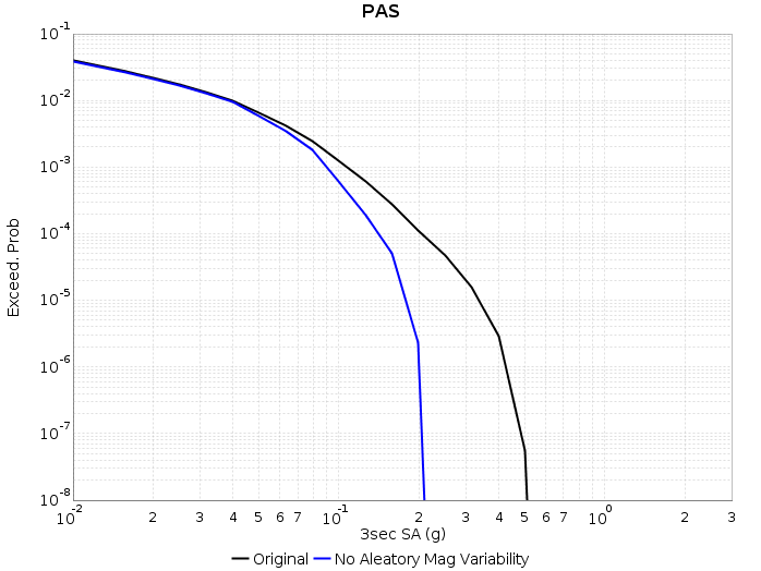
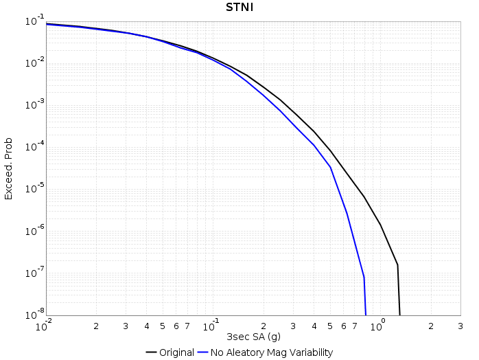
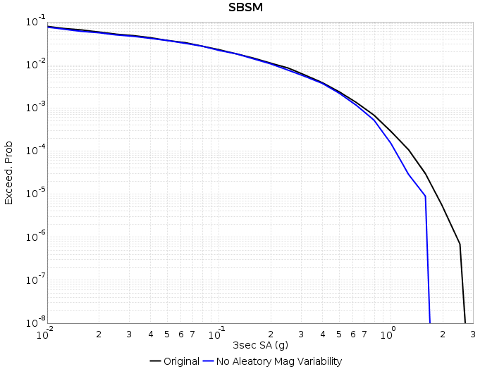
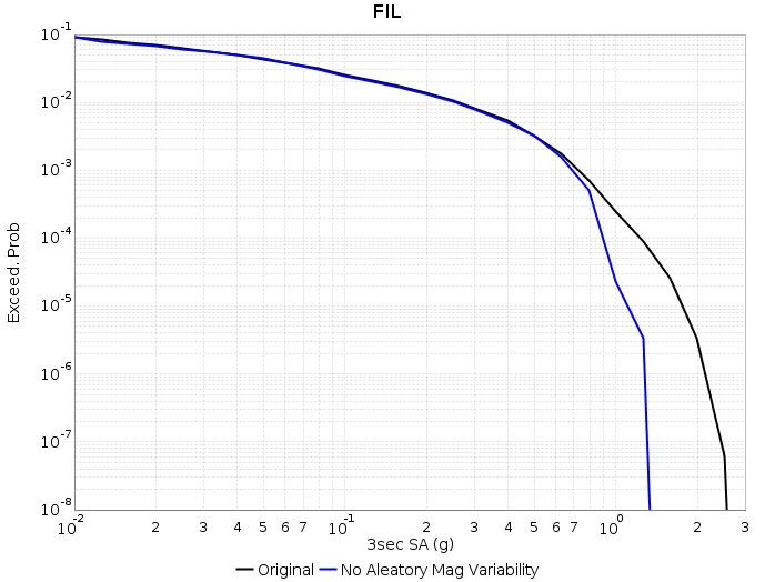
I calculated a select few CyberShake hazard curves to show the influence of this variability on results (hazard dataset 35 - CVM-S4.26, 3 second SA). The black curves are normal CyberShake curves, and the blue curves have the aleatory variability removed via the following algorithm:
For each UCERF2 rupture where aleatory variability was applied (103 sources which were used in these calculations), I find the mode of the distribution (the magnitude 7.25 rupture for the above SAF S. Mojave example), and modify rupture probabilities by assigning the total source probability to that rupture and removing the other ruptures from the calculation. This is not exactly equal to the mean magnitude for the source as the Gaussian distribution is regularized into delta=0.1 magnitude bins, but it should be close enough for demonstration purposes. Here is how that example source would look after applying this algorithm:
| Source ID | Rupture ID | Magnitude | Probability |
|---|---|---|---|
| 90 | 0 | 6.95 | 0 |
| 90 | 1 | 7.05 | 0 |
| 90 | 2 | 7.15 | 0 |
| 90 | 3 | 7.25 | 0.00049817459 |
| 90 | 4 | 7.35 | 0 |
| 90 | 5 | 7.45 | 0 |
| 90 | 6 | 7.55 | 0 |
UCERF3/GMPE Hazard Curve Comparison
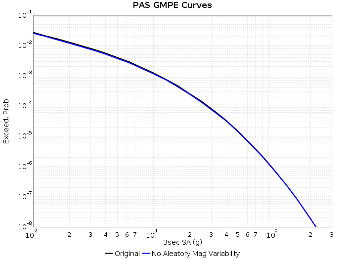
We can also do the same test with UCERF3 and the NGA-West2 GMPEs. As expected, aleatory variability is relatively insignificant for GMPEs at least with UCERF3.
UCERF3 vs UCERF2 GMPE Comparison Maps
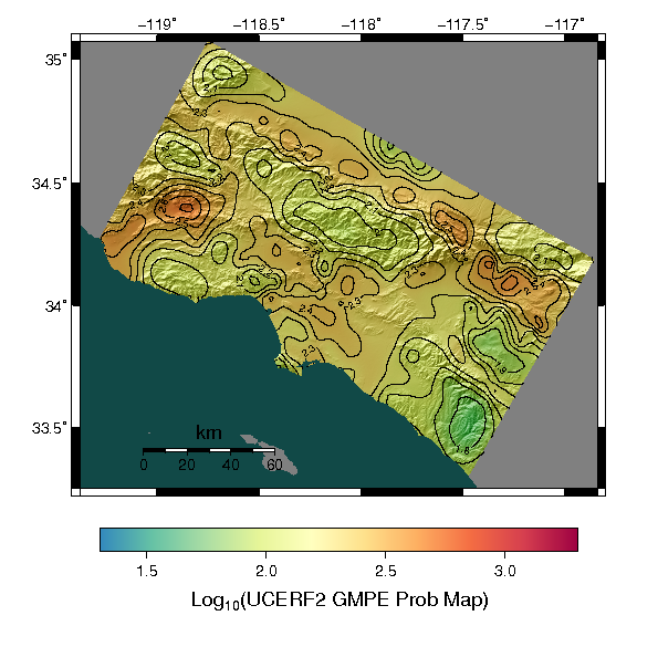
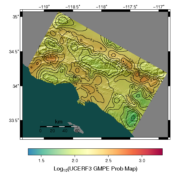
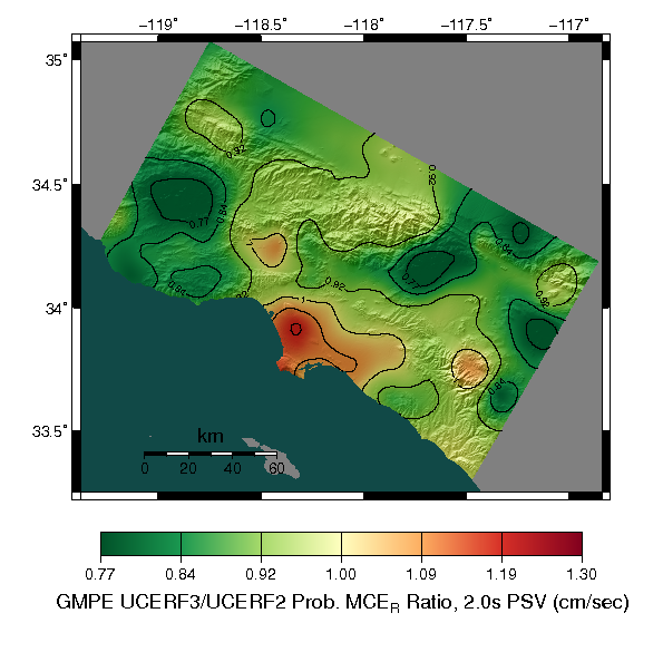
These maps compare probabilistic UCERF3 and UCERF2 MCEr results (risk targeted ground motions) for the NGA-West2 GMPEs in the CyberShake region. Trends are similar to those seen in the uniform hazard maps posted as UCERF3 electronic supplements for 1sec 2% in 50 Years and 1sec 10% in 50 years. Maps shown below are for 2 second SA.
This is the same ratio but of 2% in 50 year values:
Disaggregation
I have calculated disaggregated hazard curves for 3 CyberShake sites where the UCERF3/UCERF2 differences are greatest. In all hazard curve and fault magnitude frequency distribution plots linked below, the red curves are for UCERF2 and the blue curves are for UCERF3. All results are for 1 year Poisson models
s365: LA Basin (UCERF3 is higher)
Hazard Curves UCERF2 Disaggregation UCERF3 Disaggregation
This is the center of the red spot in the LA basin. The largest change seems related to the increase in rate on the Newport-Inglewood Fault (MFD plot).
s541: Claremont Area (UCERF3 is lower)
Hazard Curves UCERF2 Disaggregation UCERF3 Disaggregation
This is the CyberShake site where the UCERF3/UCERF2 ratio is lowest, in the Claremont area on the southeast side of the San Gabriel Mountains. Hazard at this site in UCERF2 is dominated by the Cucamonga Fault (MFD plot) which is treated very differently in UCERF3. It is allowed to link up with other faults in UCERF3 resulting in a large decrease in the overall rate of events, instead participating in larger more infrequent events.
