CyberShake interpolation
This page documents research into techniques for interpolating various CyberShake data products, performed by 2024 SOURCES intern Amelia Kratzer.
Contents
Bilinear: Hazard Curves
Procedure
Selection of Sites
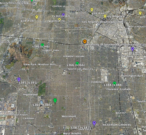
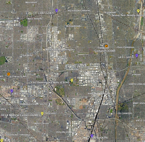
- To start, I selected 4 sites (input sites), all in the basin, that formed a 10km by 10km square inside which there was at least 1 site to interpolate (interp site). This way I could compare the simulated values for that site to the interpolated to check the accuracy of my interpolation.
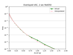
a) 1st chosen area: USC as there are three sites on the exterior for 1D linear interpolation and two sites on the interior for 2D linear interpolation
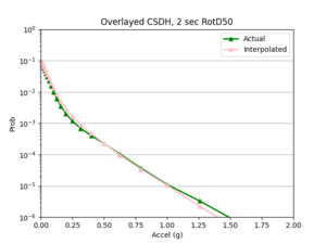
b) 2nd chosen area: CSDH
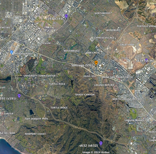
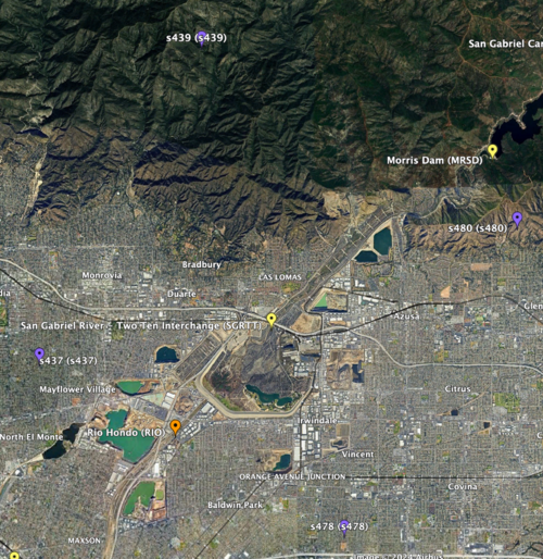
- Next, I selected two locations where some of the sites were not in the basin, to test how different velocity structures may affect the accuracy of the interpolation.
a) 1st location: STG
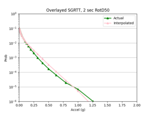
b) 2nd location: SGRTT
Linear Interpolation of Hazard Curves
- Download and plot the input sites' hazard curves.
- Query CyberShake database to get the X shaking values and Y probability values for input and interp sites.
- Use UTM to convert locations of sites to meters from lat/lon.
- Calculate the X’ and Y’ distances to my interpolated site from the left and top edge of my square since the 10km by 10km square is on a rotated axis.
- For each shaking value, use the probabilities of shaking at the input sites and these X’ and Y’ distances to perform bilinear interpolation.
- Plot the (shaking value, interpolated probability) points to form the interpolated hazard curve.
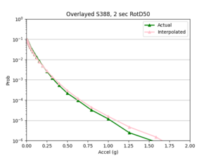
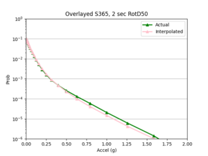
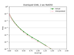
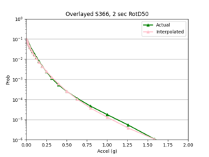
- Overlay the interpolated hazard curve and the simulated hazard curve on single plot for comparison.
Error Calculations
- I compared the simulated probabilities to the interpolated probabilities for the given site, and calculated the absolute percent difference at each acceleration value. Percent difference accurately models the accuracy of the hazard curve since it reflects the larger differences in the simulated and interpolated results at the higher acceleration values.
- I chose two metrics by which to compare the accuracy of my interpolations - max percent difference and average percent difference.
Results
1D Linear Interpolation
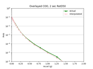
Note: no error metrics were calculated for the 1D linear interpolations, but overlayed plots helped to assess the accuracy of the interpolation.
2D Bilinear Interpolation
- 4 sites, all in basin
a) USC area
b) CSDH area
- 4 sites, not all in basin
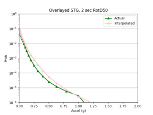
a) SGRTT and STG locations
Findings: the bilinear interpolation was more accurate, with a lower max percent difference and average percent difference, when the 4 input sites were all in the basin compared to when I varied the velocity structures of the input sites.
For example, comparing USC, in which all 4 input sites are in the basin, to SGT, where some of the input sites are not in the basin, reveals that the max percent difference for STG was more than double that of USC, 40.4% to 91.1%, respectively. The average percent difference for STG was more than 4 times that of USC, 19.8% to 4.1%, respectively.
Next steps
I will next try to interpolate the shaking RotD50 values themselves to see if the interpolation is more accurate than that of the hazard curves.
Bilinear: Intensity Measures
Procedure
I followed a very similar procedure to the interpolation of the hazard curves. The selection process for the sites and linear interpolation method were identical.
- A key difference to note between interpolating hazard curves versus IM values for a site is that there was a lot more data that needed to be interpolated with the IM values. Hence, I switched to running my code on Frontera.
- My code interpolates a single event, which has a unique event id, all rupture variations for a single rupture, or all events for a site.
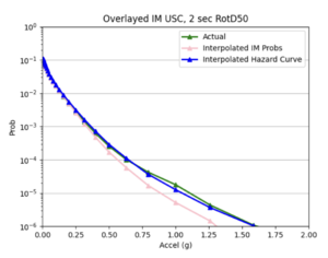
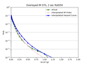
- After I ran the interpolation code, I used the interpolated IM values to create hazard curves for the interp sites. I then compared these curves to the hazard curves produced from the direct interpolation of a site's hazard curves and the simulated hazard curve.
Results
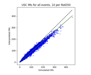
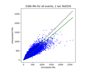
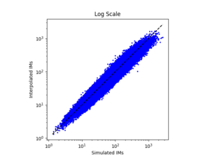
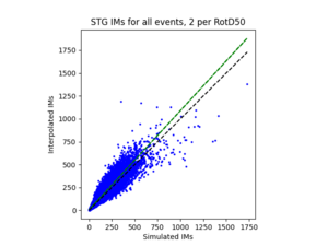
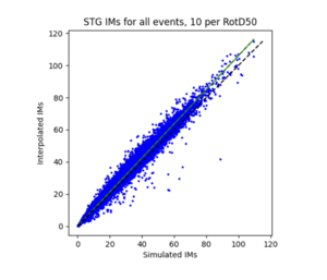
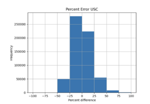
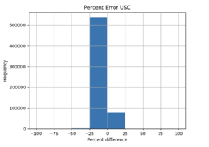
To measure my accuracy, I created scatterplots comparing the simulated to the interpolated IMs and histograms of their percent differences.
- 4 sites, all in basin
a) USC area all events
b) S366 area all events (includes log plot)
- 4 sites, not all in basin
a) SGRTT area all events
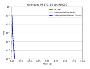
b) STG area all events
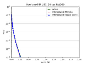
For both USC and STG, there is a greater amount of scatter for period 2 compared to period 10. This is reflected in the hazard curve plots since the period 10 IM interpolated curves more closely resemble the simulated curves than the period 2 IM interpolated curves. Also, for both USC and STG, compared to period 2, there is a lower frequency of more extreme percent differences as shown in the histogram plots below.
Findings: interpolating the hazard curves produces more accurate results than interpolating the IM values.
The overlaid hazard curve plots show that the interpolated hazard curve more closely resembles the simulated curve than the interpolated IM curve.
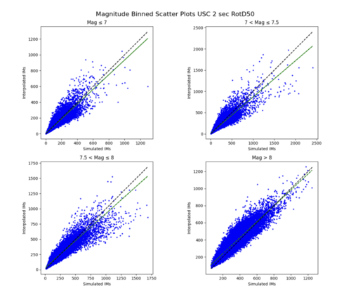
This is likely due to the under prediction of the IM values for magnitude 7 - 8 events as shown by the scatterplot by magnitude plot below.
ML: Hazard Curves
I first created a csv file containing all CyberShake sites that are not on the 10km grid but have 4 surrounding input sites, as these data points are used as input for my ML model.
1) I wanted to start simple, so I created a network to interpolate the hazard curve probabilities at x = 0.50119 g.
a) Neural network architecture
- 8 inputs: the probability values of the 4 sites on the 10km grid along with there distances to the interpolated site.
- 1 output: the interpolated probability value
- 3 hidden layers with softplus activation function
- I log normalized the probabilities and output and normalized the distances
b) Results
i) Initial run
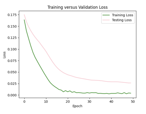
My model appears to be overfitted since the training loss is significantly better than the testing loss.
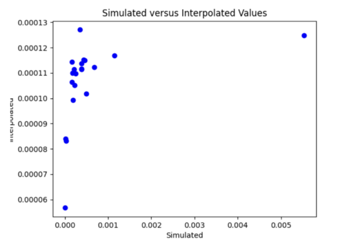
2) Next, I created 51 networks, following the same architecture as my first network, so I could interpolate the hazard curve probabilities for a site at all 51 x values.
a) Results
